Smartphone makers are like school kids - they see the popular guy wear a weird hat and rush off to the store to buy weird hats too. It's easier than developing their own style. Apple has been just such a trend-setter in Smartphone High and after successfully undermining the headphone jack, it's now responsible for an explosion of notches.
But screen notches didn't originate with Apple - time for a detour to History class. As former Motorola designer pointed out on Twitter, the MOTOFONE F3 had a notch way back in 2006. This one barely had an UI, though, so the notch didn't get in the way. The Motorola WILDER had an extra screen - no notch here, there was plenty of room on the bezels. But later a similar arrangement was used by the LG V10 and V20, which had thinner bezels so the main and secondary screens came together - you can think of this as an off-center notch.
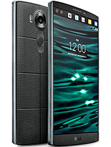
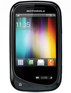
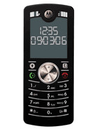
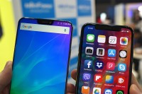
However, Apple's iPhone X stands apart from these because they all treated that extra bit of screen as a separate screen. The X tries to flow the app's UI around the notch and just leaves padding when it can't. It's a clunky solution, but marketing demanded thin bezels. And now we hear that Google is considering adding software support for notches to Android P, so notches may be here to stay.
We don't necessarily like them, but some are better executed than others. And the MWC grounds had plenty of examples of notched screens so we sought the best and worst examples.
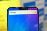
Asus adopted the notch for the Zenfone 5 and Zenfone 5z. The company boasts that its notch is smaller than Apple's (mocking the iPhone X while copying it). However, it's not the smallest notch as we'll see in a minute. Looking at that bottom bezel, this seems more like a notch for the sake of fashion rather than necessity.
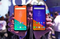
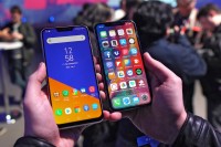
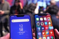
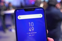
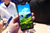
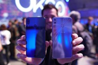
There's some history of imitators beating the original - e.g. Hydrox was the original Oreo biscuit yet nobody has heard of them. Still, we don't think that Asus will be the Oreo biscuit of phones. We do hope that these companies realize that Apple's success came before the notch, not because of it. Designing a phone with part of the screen cut out won't suddenly boost it to iPhone levels of success. Plus, analysts make out the iPhone X to be something of a disappointment.
That said, some managed to impress. The Ulefone T2 Pro is one of the few phones to live up to the "bezel-less" marketing talk. Just look at it, the border is so thin that a pixel might fall of the edge of the screen! Hyperbole aside, Ulefone achieved a cool, futuristic look and for that we don't mind the notch at all.
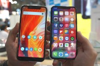
Its sibling, the Ulefone X, is less impressive in that respect. There's a fairly thick border running around the screen, comparable with the iPhone X, and with the thick bottom bezel, it makes you wonder if a notch was really necessary. How can hardware novelty and a needless clone live under the same roof?
Let's change gears and look at the Wiko View2 and View2 Pro. The notch goes deeper into the screen and holds a prominent selfie camera. The design is very similar to the Essential phone. We like that the status bar has more room for notification icons, iPhone X-style displays run out of room just by showing the time and signal strength.
We like the Wikos for another reason. Sure, they look like Andy Rubin's Essential phone, but few others do. So this gives the View2's front a unique appearance, something that can rarely be said these days. For a bit of personality, we might live with a notch.
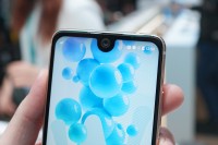
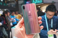 Wiko View2 and View2 Pro
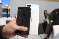
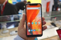
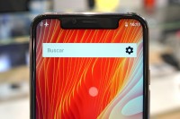
Then we get to a bunch of "me too" devices. Look at this Leagoo S9, for example. Sure, it costs just $150, but the software hasn't been prepared for the notch at all, not even the rounded corners - look at how it cuts off part of the icons in the status bar.
The Noa N10 is hardly any better in this respect.
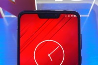
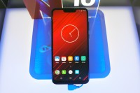
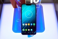
The Oukitel U18 does it too to an extent, though at least it has the good sense to spread out the icons on both sides of the notch, alleviating the problem a bit.
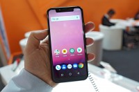
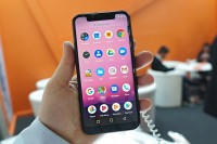
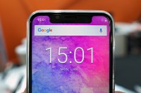
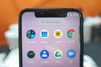
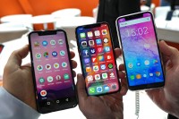
We're quite impressed by the Ulefone T2 Pro - it looks like you're holding an image without its frame. It may not be terribly practical for daily use from an ergonomic standpoint, but it sure looks so cool.
And we kind of dig the camera notch used by the Essential phone and the Wiko, just because they break up the monotony of the rectangular screen. Even the recent trend of rounded corners doesn't break away from the tedium of modern smartphones - a featureless front that can be mistaken for any other phone.
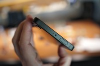
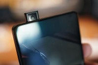
The vivo APEX showed it's possible to eliminate the top bezel entirely without having a notch at all. However, it had to put the speaker below the glass like the original Xiaomi Mi Mix. We didn't like the audio quality and it's so loud that everyone can hear your conversation. So, moving the earpiece is impractical. But the APEX did demonstrate that keeping the selfie camera without having a notch is doable (another way to do it is like the Honor 7i ).
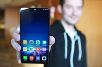
While touring notched phones at the MWC, we started to reconsider Google's position in the Android world. We always thought of it as "Google's Android" but "Samsung's TouchWiz" (now Grace) or "HTC's Sense". Now, though, Google seems more like a curator of Android features rather than a leader and innovator.
That was always the case, we suppose. It took Xiaomi nearly a year to get Google to officially support taller than 16:9 screens and now the Pixel 2 XL uses one. And it has no audio jack. The notification area didn't have quick toggles until makers put them there. And split screen was pushed by makers long before Google adopted it officially (it took so long that Apple beat them to the punch).
Does Google really believe in screen notches? As in "Pixel 3 will have a notch" believe in them? Or is the company going with the flow, unable to redirect the flow of river Android? It's starting to feel like brands - even low volume ones - have more say in what next year's Androids will look like than Google does. With Apple you're never in doubt who's in charge, even when the team at Cupertino borrows features from others.
Comments
Post a Comment